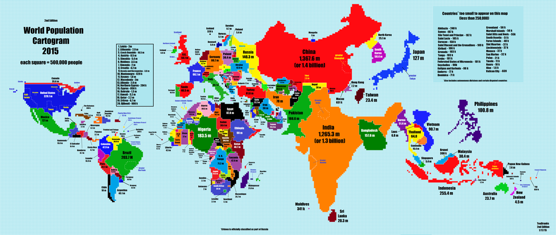
We all know that India and China have large populations, but this map emphasises their size on a global scale. Compared to conventional world maps, the two Asian powerhouses dominate. Along with several East Asian neighbours – Bangladesh, Japan, the Philippines and Indonesia – their contribution to the global population is clear.
The size of Nigeria and Brazil compared to the rest of Africa and Latin America is equally apparent.
The map also effectively highlights the contribution of cities and regions to total populations. For example, the greater Tokyo region accounts for a significant proportion of Japan’s overall population. Equally, Delhi, Shanghai and Mumbai all occupy areas larger than many European nations.